Brainbox AI
Role
User Research
Scoping
UI/UX Designer
Interaction Designer
Team
1 UX/UI Designer
1 Project Manager
1 Engineer
Duration
February 2025 (on-going)
Highlights
Reimagining the UI/UX for KPIs and metrics to help energy managers and building operators optimize energy efficiency, reduce costs, and achieve sustainability goals.


Portfolio KPI
Real-time portfolio KPIs help facility managers to shift from reactive troubleshooting to proactive optimization. These metrics eliminates guesswork, streamlines reporting, and turns building performance into actionable insights.


Single Building Measurements
Building specific KPIs and information graphics help energy managers track the effectiveness of energy efficiency measures, justify investments, and sharing progress to stakeholders.
Cloud Building Management Software (CBMS)
CBMS is the company's external flagship software platform, designed to streamline building portfolio management with real-time visibility and advanced analytics. It replaces SPG (Single Pane of Glass), our legacy system currently being phased out.
Design Process
Stage 4. User Testing & Iterations
Organized a series of remote user testing sessions, employing both qualitative and quantitative methods to evaluate the app's usability and effectiveness in fostering collaborative learning. Analyzed feedback to identify patterns and areas for improvement, leading to several design iterations that enhanced user engagement and satisfaction.
Stage 5. Final Presentation and Documentation
Prepared an in-depth presentation and comprehensive documentation detailing the research findings, design rationale, user testing outcomes, and the iterative design process. Highlighted the app's potential to transform the educational landscape by making learning more interactive, engaging, and collaborative.
User Research
Target Audience
Facility managers: oversee the operation and maintenance of building systems.
Energy managers: monitor and optimize energy usage across buildings or portfolios
Interview Insights
To understand the problems and challenges of SPG, I interviewed with the customer success and sales team.
Lack of customization
Users want to filter data by months
Users want to group stores by region
American users want units in therms
Unclear comparisons
Users want to compare current vs expected savings
Users want to compare data from last & current month
Poor user experience
KPI details are hidden
KPI data defaults to Option A
Takes many steps to get to M&V results
"Give us monthly cost breakdowns, the ability to adjust date ranges easily, and projections for grouped buildings—this is critical for our decision-making."
-Anonymous user
Problem Space
Constraints :
Time - we need to migrate feature and data to CBMS asap
Data limitations - we don't have data for some features
How can we help facility managers track and measure metrics and performance better?
How can we improve the UI/UX of these metrics while staying consistent with the existing CBMS designs?
SPG Design Issues
Below is an overview of the Portfolio (left) and Energy page (right).


Portfolio KPI
Most of our users are American and they don't use m³
Facility managers want to see changes to the previous month
KPI content is compressed and misaligned
Portfolio KPI Popup
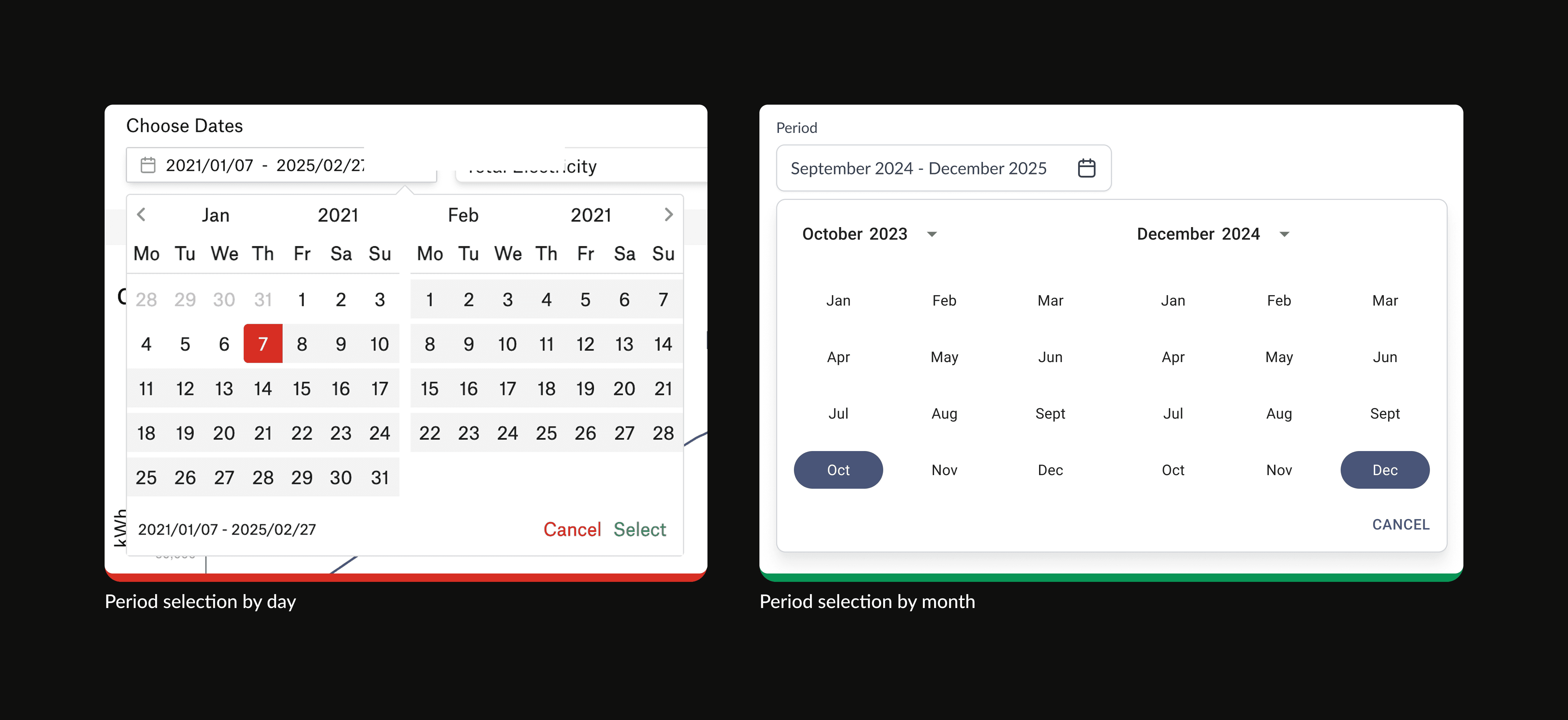
Users want the ability to select a time range
American users use therms instead of m³
The download button is placed in the bottom - not clear to the users
Energy Page
The percentage of change lacks context
Definition lacks proximate relevance
Inefficient placement of the customization bar
Energy Page Charts & Graphs
Users want monthly comparisons not daily
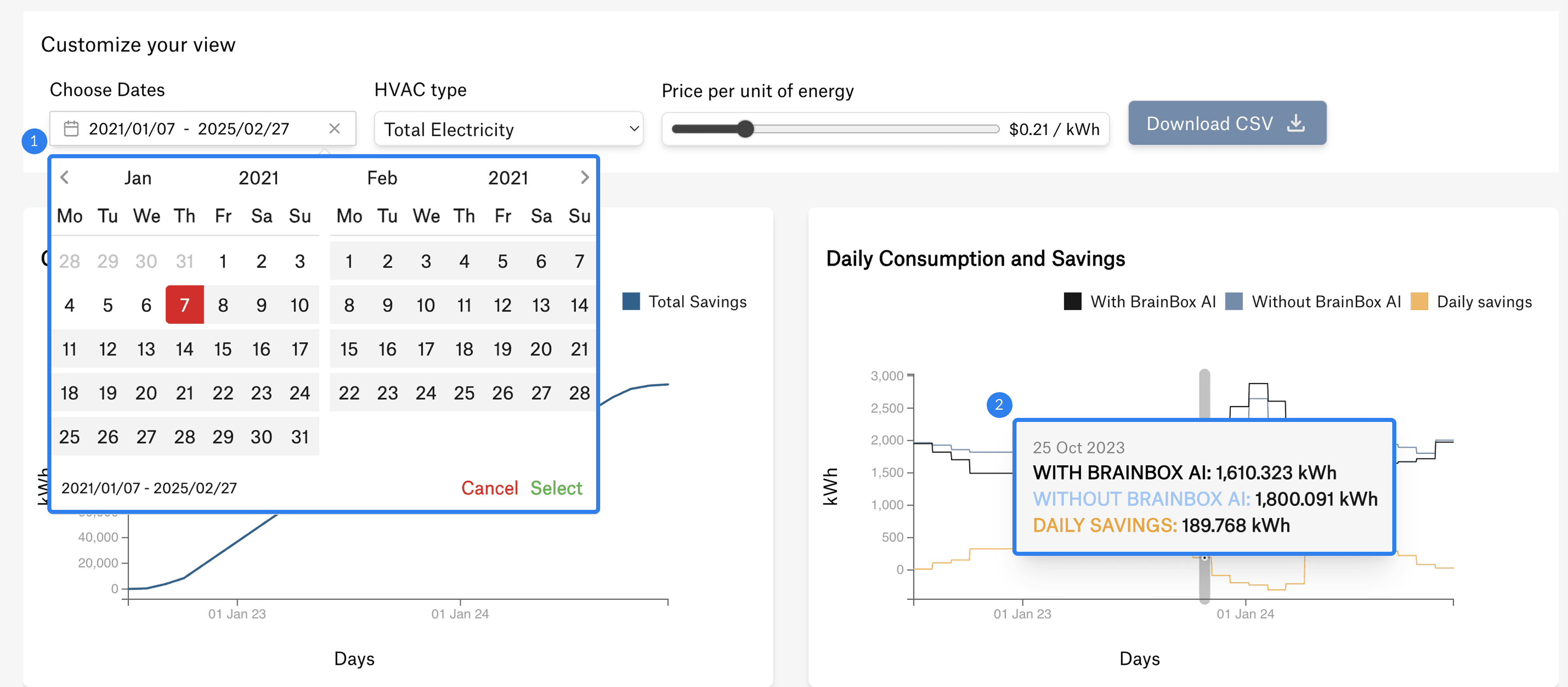
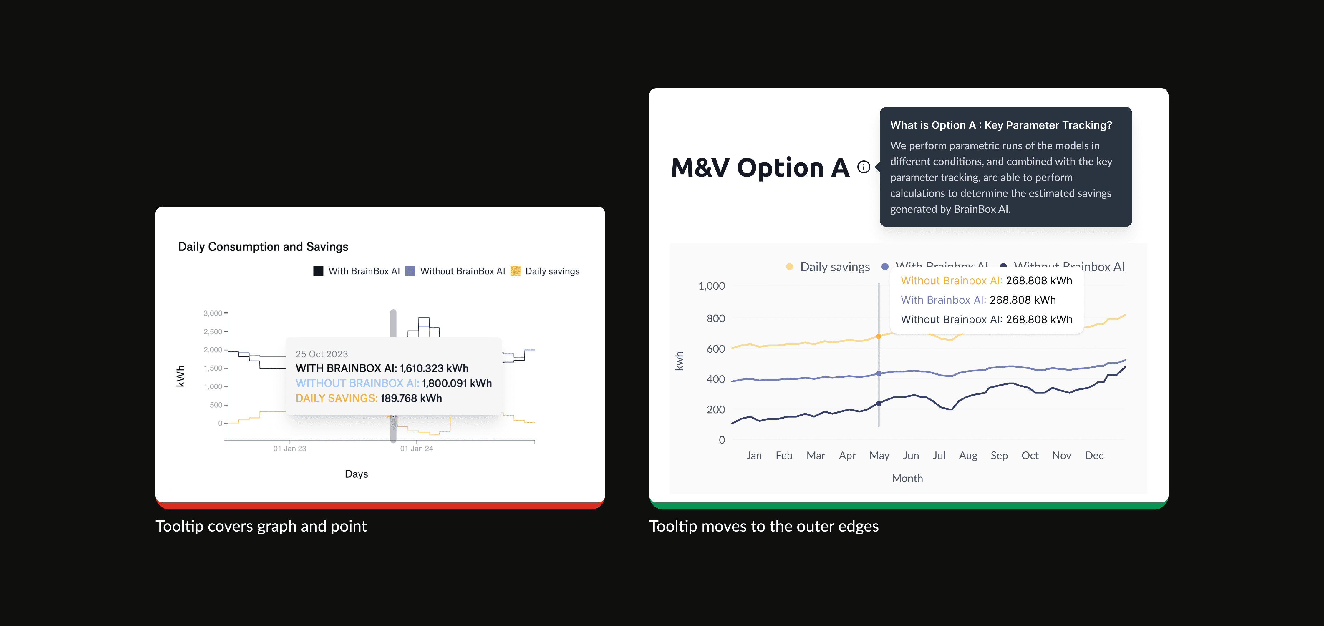
The tooltip is covers most of the graph
CBMS Page Structure
To ensure that metrics are shown in the right location and to the appropriate users, I analyzed the CBMS's grouping logic and how certain pages are reached.
Information on the overview page is separated in three levels :
1) Porfolio (all sites)
2) Groups of buildings by organization, country, etc
3) Single building
Presenting Insights & Prioritizing Tasks
Discussion
Key insights and issues in SPG were presented to the Product Manager and the Energy team. Following this, we worked closely with the Engineers to prioritize tasks and refine the roadmap.
Current Priorities
KPI presented in months
Ability to filter buildings by group
Show percentage change in KPI
Provide the flexibility to change units
Select a month-to-month time range
CSV with better formatting
Data on a site and portfolio level
Projections
Energy M&V
Comparisons against baseline projections
Chart for ROI
Explanation on savings
Improved graphics
Future
Design Process
Information Organization and Structure

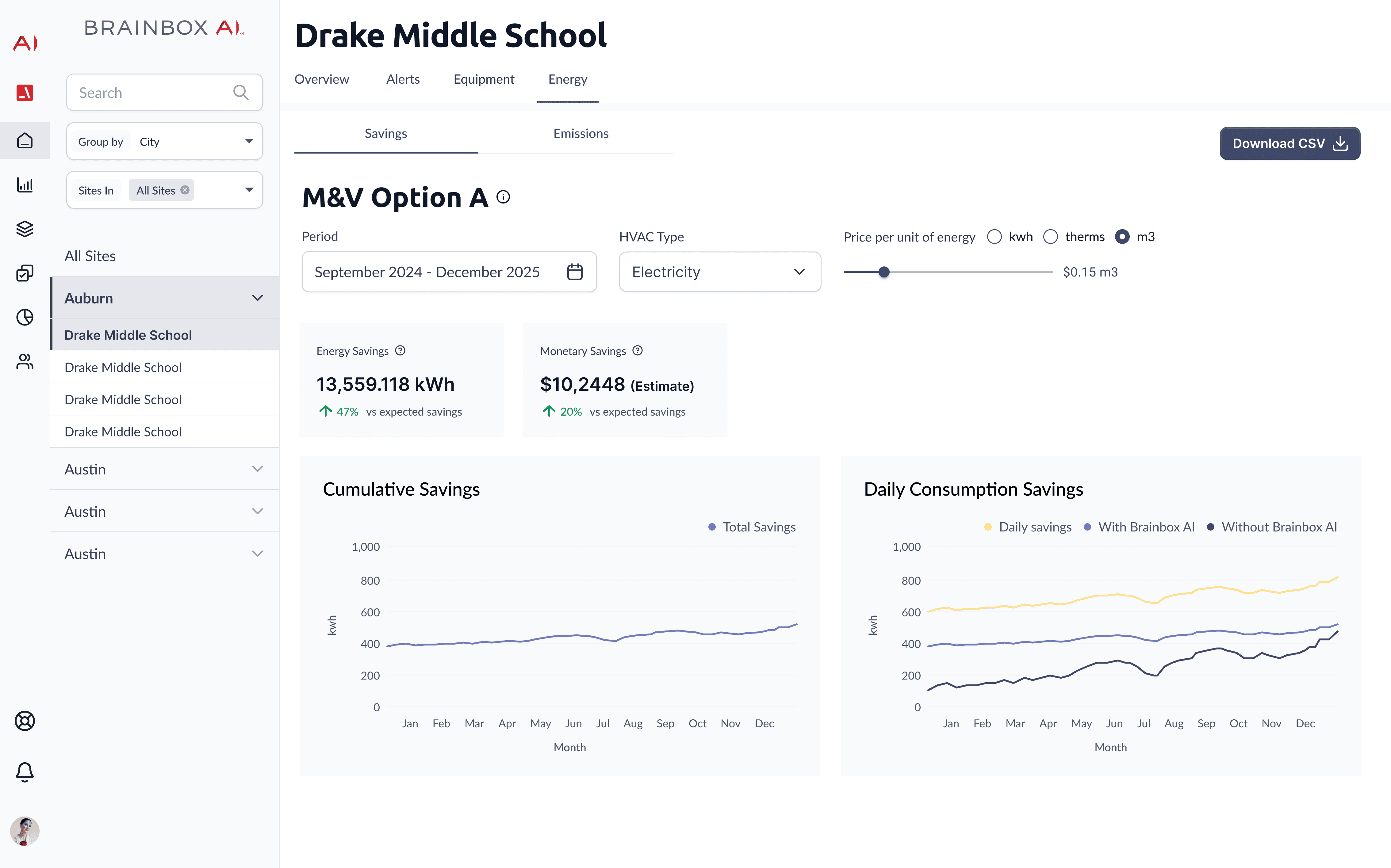
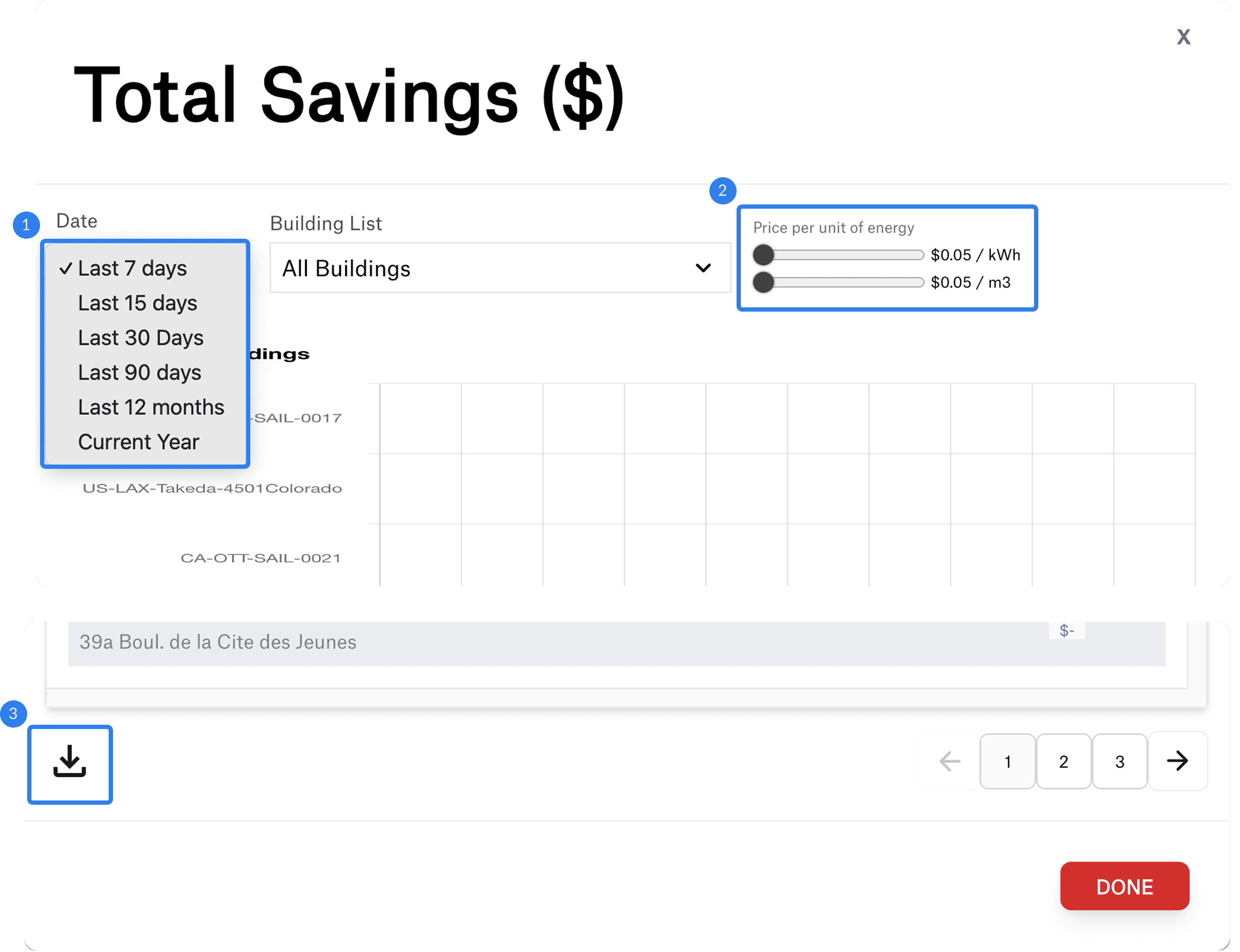
Energy Results
The Energy page is divided into two sub-pages—Savings and Emissions—to provide focused analysis. A customizable toolbar is positioned at the top, allowing users to dynamically adjust parameters and immediately visualize the impact on the data below. The Download button is placed near the top, enabling stakeholders to export and share key insights easily.
Detailed Improvements
Second Phase
Changes: date filter, units, KPI subtitle, and tooltip
The old design is displayed on the left, and the improved version is on the right


Current Design (Work in Progress)
Portfolio KPIs
Key metrics are prominently displayed at the top of the page for quick insights. Clicking on any KPI reveals detailed information along with customization options, allowing for a tailored analysis experience.
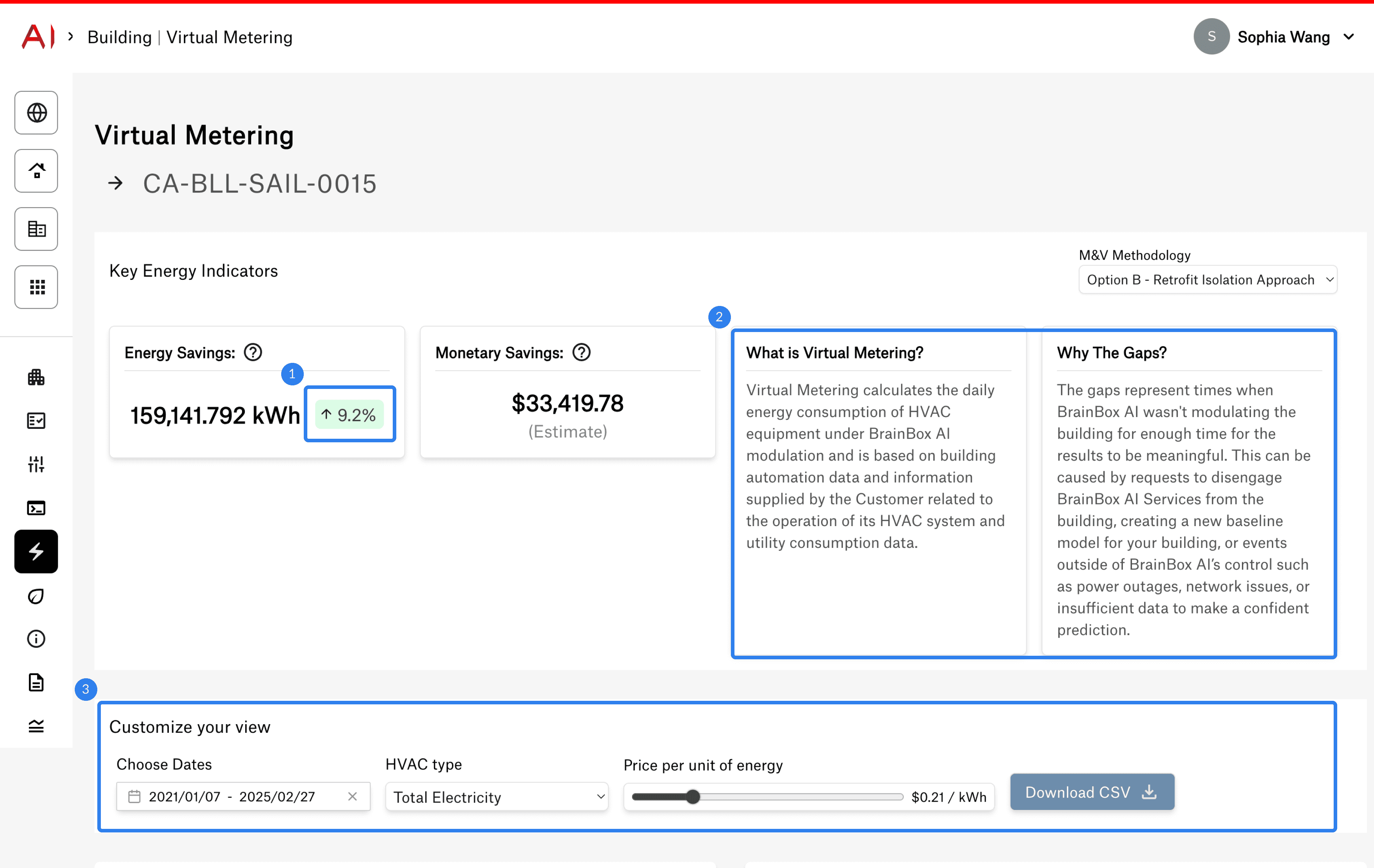
Single Building Measurement
The customization bar is positioned at the top, ensuring that any input changes instantly update the KPIs and infographics below. Definitions are conveniently placed next to relevant content for easy reference. When hovering over the graph, tooltips appear outside the graphics, allowing users to view exact data points without obstruction.
Impact
Learnings
Create the Scope First
One lessons I learned during this project was the value of a clearly defined scope. When a task lacked clear boundaries, it often led to unnecessary iterations and delays. Instead of waiting for my product manager to provide a scope, I took the initiative to create one myself—outlining objectives, constraints, and use cases. This proactive approach not only streamlined my workflow but also made it easier for the PM to review and refine the direction.
Open Collaboration with Stakeholder
Another lessons I learned was the importance of creating a space where everyone involved in the design process feels heard. By involving all stakeholders early and often, we were able to address concerns and gather diverse perspectives in real time. This approach helped prevent misunderstandings and ensured that feedback was discussed openly rather than being filtered through multiple conversations. When disagreements arose, they could be resolved immediately through collaborative discussions instead of the product designer having to relay information between teams separately. This not only streamlined decision-making but also fostered a more transparent design process.

